A digital product may have only one file, but the same product often needs to appear in several visual contexts. The store page needs a clean image that explains what is being sold. A Pinterest pin may need a taller composition. A social post may need more room for a headline, while an email banner has to work in a wide crop. Reusing the exact same image everywhere can save time, but it can also create awkward crops, tiny details, and repetitive promotion that makes every post look identical.
The better approach is to treat one strong product visual as a source, then adapt it for each placement without losing the identity of the product. That sounds simple until every variation starts drifting in color, styling, or emphasis. Manual redesign can become slow when several formats are needed, so a reference-based option such as ChatGPT Images 2.5 API can be explored when a creator needs to produce or refine supporting visuals from an existing image and a focused instruction. The workflow below shows how to decide what should stay fixed, what should change, and how to review each version before publishing it.
Start With One Master Product Visual
Begin with a master image that represents the product accurately rather than trying to design every channel at once. For a template bundle, that might be a clean arrangement of several representative pages. For an ebook, it may be the cover shown clearly at readable size. For a printable pack, it could be a small selection of pages that communicates the range without turning the image into a crowded collage.
The master should answer three questions: what is the product, which elements make it recognizable, and what must remain visible after cropping. Write those answers down before creating variations. A color palette, cover artwork, device frame, package shape, or recurring illustration may be part of the visual identity. Decorative props usually are not. This distinction prevents later edits from protecting the wrong details.
Keep a clean version without promotional text. Copy that works on a square store image may become cramped on a narrow mobile graphic, while a clean master is easier to adapt.
Adapt the Image for Each Channel
Repurpose a visual by changing one requirement at a time. Define the placement first, then decide how the source image needs to behave inside it.
- Match the Canvas to the Placement
Start with the final shape of the asset. A store thumbnail, vertical pin, square social post, and horizontal banner put different pressure on the composition. Place the master image inside the target ratio before changing colors or props. If the product becomes too small or an important edge disappears, you have a composition problem.
Use the available space deliberately. A vertical layout can stack supporting elements around the product, while a wide banner may move the product to one side and leave room for copy. The product should remain easy to recognize before text is added.
2. Decide What the New Version Must Do
Each variation needs a job. A store image may explain the product, a pin may create curiosity, and an email graphic may simply remind subscribers what the offer looks like.
Write a one-sentence purpose before designing: “Show the printable pack in use on a desk,” or “Create a vertical version that keeps the cover large and leaves space at the top.” This gives you a concrete standard for judging the result instead of asking whether it merely looks attractive.
3. Create a Controlled Visual Variation
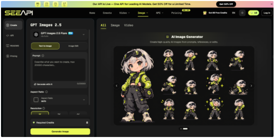
When a new scene, crop, or background would take too long to rebuild manually, Image 2.5 API can be used with the master image as a reference. Provide the target placement, the background or setting to change, and the product details that must remain recognizable. The tool can generate or edit the visual from those instructions. Afterward, compare the result with the source and check proportions, cover artwork, object placement, and any details customers would use to identify what they are buying.
If a version looks more dramatic but makes the product less accurate, reject it. Marketing imagery can change the surroundings without quietly redesigning the item.
4. Add Copy Only After the Image Works
Once the visual succeeds without text, add only the copy the placement needs. A promotional image rarely needs the full title, subtitle, price, feature list, and call to action at the same time. Too much text forces the product into a smaller area.
Check the graphic at the size people will actually see it. If the headline is readable only when zoomed in, shorten it. If the product is recognizable only on a desktop screen, enlarge it. The important test is whether the hierarchy survives real display conditions.
Protect Consistency While Creating Variations
Variation should come from format, setting, framing, or message rather than from changing the product’s identity. A useful rule is to classify every visual element as fixed, flexible, or disposable. Fixed elements might include the actual cover, logo, key colors, or distinctive interface shown in the product. Flexible elements can include the background, camera angle, supporting objects, lighting, or crop. Disposable elements are details that can disappear entirely without changing what the customer thinks the product is.
This classification is especially useful when you create a batch. Suppose a digital planner is promoted with a desk scene, a tablet scene, and a minimal flat lay. The setting can vary, but the planner cover should not change typography or colors between versions. If one image introduces a different cover style because it “looks better,” the set stops functioning as a coherent campaign.
Keep a small reference sheet beside the project. Include the master image, two or three colors, the preferred product scale, and a note describing what must never be altered. This is faster than relying on memory and makes later revisions easier when the campaign grows.
Test Whether Each Version Still Works
Review each asset in context rather than as a standalone image. Put the store image into the product-card layout, preview the vertical graphic at mobile width, and place the email banner near the copy it will accompany. A design can look balanced on an empty canvas and still fail once buttons, titles, or surrounding content compete for attention.
Use three pass-or-revise signals. First, the product should be identifiable within a quick glance. Second, the most important detail should survive the crop. Third, the image should have one obvious focal point. If several props, headlines, and decorative elements compete with the product, simplify the composition.
Then compare the full set side by side. They should feel related without looking duplicated. If every image uses the same framing, the campaign can become monotonous. If every image uses a completely different palette and visual language, recognition suffers. Aim for controlled difference: the same product identity, expressed through several useful layouts.
Remove any version that exists only because you created it. A smaller set of purposeful images is easier to publish and update than a batch of near-duplicates.
Build a Repeatable Visual Publishing System
A reusable product-image workflow starts with one accurate master, not with a pile of channel-specific graphics. Define which visual details are fixed, decide the job of each placement, adapt the composition to the target format, and review the result at its real display size. This sequence makes it easier to spot whether a problem comes from cropping, styling, text, or product accuracy instead of redesigning everything at once.
Over time, save the decisions that repeatedly work: preferred ratios, safe margins, common background styles, product scale, and the kinds of variations that are actually useful. The next launch then becomes a controlled adaptation process rather than a fresh design project. You can still experiment with new scenes and promotional ideas, but the experiments happen inside a stable visual system. That balance gives each channel enough variety to feel native while keeping the product recognizable wherever a customer encounters it.